Is Your Website Actually Mobile-Friendly?
 Written by Tim Dailey, founder of Digital Gibberish
A website is mobile-friendly when someone can read it, tap what they need, and get in touch, all on a phone screen, without pinching to zoom or fighting a menu that won’t close. Web people call this “responsive design,” a site that reshapes itself to fit any screen. You don’t need the term, just the result. Most owners have never opened their own website on their phone the way a customer would: mid-search, on mobile data, in a hurry.
Key takeaways
- Test on a real phone: readable text, a tappable phone number, and a menu that opens and closes.
- About half of U.S. web traffic is on phones, and Google indexes and ranks the mobile version of your site.
- Fix in this order: tappable phone number, readable text, menu, pop-ups, images and forms, then speed.
- Google’s “good” speed targets: main content in 2.5 seconds, a tap response in 200 milliseconds, layout shift of 0.1 or less.
The two-minute test
Open your website on your phone, not your laptop’s mobile preview. Try three things:
- Read the homepage headline without zooming in. If the text is too small to read comfortably, it’s too small for your customers too.
- Tap your phone number or “Contact” button with your thumb, the way you actually would. If you miss it, or it’s buried below a hero image that takes up the whole screen, that’s a real problem, not a nitpick.
- Open the menu, then close it. Some mobile menus open fine and then trap you, with no visible way back to the page.
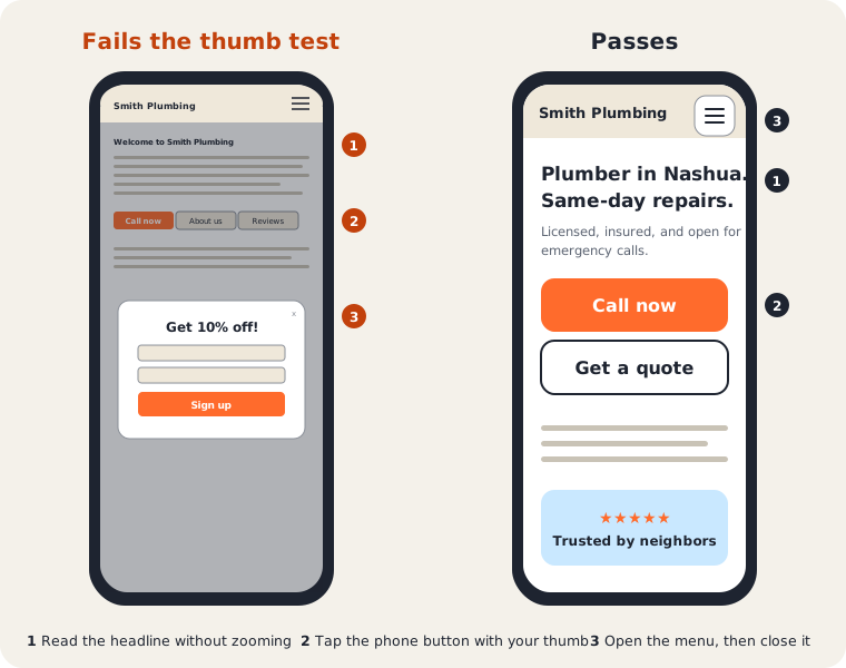
If any of those failed, you don’t need a full redesign to know something’s wrong. You need to fix that specific thing.
The mistakes that come up again and again
A few problems account for most mobile complaints:
- Text too small to read without zooming. Google’s Lighthouse testing tool has used 12 pixels as the line below which text counts as too small to read. Treat that as a floor, not a target. If you have to zoom, it’s too small.
- Buttons and links placed too close together. Google’s web.dev guidance on tap targets recommends buttons about 48 pixels across with roughly 8 pixels of space between them. If someone can’t tap “Call now” without also hitting “About us,” they’ll give up.
- Pop-ups that cover the whole screen on load, especially ones without an obvious close button.
- Images and forms that don’t resize, forcing a visitor to scroll sideways to see the whole page.
- A phone number that isn’t a tappable link. On a phone, it should start the call with one tap.
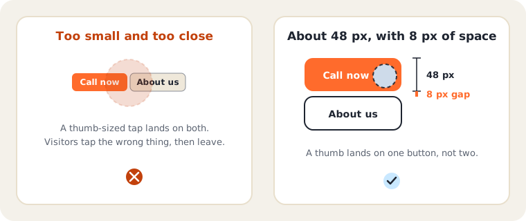
Most of these come from a website that was designed on a desktop screen first and never properly checked on a phone afterward. That’s more common than it should be, even on sites built in the last few years.
How much of your traffic is on a phone?
Roughly half. Statcounter’s U.S. figures for September 2026 show mobile at about 49% of web traffic, desktop at about 49% and tablets at about 2%. That counts all web browsing, not only local searches, and your own customers may lean either way. Check your own split in Google Analytics, under the reports that break traffic down by device. But the practical takeaway is the same: about half your visitors may be judging you on a small screen.
Why Google cares: mobile-first indexing
Google indexes and ranks the mobile version of your content. In its words, it uses the mobile version of a site’s content, crawled with the smartphone agent, for indexing and ranking. A site that’s polished on a laptop but stripped down or broken on a phone is being judged by the stripped-down version.
Google’s guidance for sites includes:
- Same content on mobile and desktop. Hiding text in tabs or accordions is fine if it’s still there. Removing it on mobile isn’t.
- Same headings, image descriptions and page titles on both.
- Don’t block files the mobile page needs. If your robots.txt blocks images or scripts, the mobile page can look broken to Google.
Speed on a phone
A slow page loses people before they read a word. Google’s Core Web Vitals give three “good” targets: the main content loads in 2.5 seconds or less, the page responds to a tap in 200 milliseconds or less, and the layout doesn’t jump around (a shift score of 0.1 or less). Google measures these on real visits, and a page passes when it meets all three for at least 75% of them.
Google’s own page-experience guidance is measured about it. Core Web Vitals are used by its ranking systems, but there is no single page-experience signal, and Google says it will still show the most relevant content even if the experience is poor. So speed won’t rescue a thin page, but a slow, jumpy page makes it harder for a good one to win the customer.
You can see your own numbers for free in PageSpeed Insights. Run it on your homepage and your most important service page.
Fix these first
If the test turned up several problems, this order usually pays off:
- A tappable phone number and a visible Contact button.
- Text a person can read without zooming.
- A menu that opens and closes cleanly.
- Pop-ups that are small, delayed or removed.
- Images and forms that fit the screen.
- Page speed, starting with oversized images.
If you’re not sure where to start
If the two-minute test turned up a problem, start with the specific thing that failed instead of assuming you need to start over. A cramped menu or oversized pop-up is often a quick fix. A site that’s fundamentally hard to use on a phone, built years ago for desktop screens, is a bigger conversation.
Mobile checks are also one piece of the local SEO checklist, and if you’re weighing a rebuild, what a website should cost gives real ranges.
Common questions
How do I test my website on my phone? Open it in your phone’s browser, not an app, and try the three tests above. Do it on mobile data as well as Wi-Fi, since that’s how many customers will see it.
Is “mobile-friendly” the same as “responsive”? In practice, yes. A responsive site rearranges itself to fit the screen. A separate mobile site can also be mobile-friendly, but Google asks that both versions carry the same content.
Does mobile-friendliness affect my Google ranking? Google uses the mobile version of your site for indexing and ranking, and its ranking systems use Core Web Vitals. It’s one factor among many. Relevance still matters most, and a fast, tidy site won’t make up for a page that doesn’t answer the question.
What’s the fastest fix? Usually a tappable phone number at the top of the page. It takes minutes and helps the customers most ready to act.
Do I need an app? No. For a local business, a website that works well on a phone does the job.
Should I use a phone or a testing tool? Both. Tools like PageSpeed Insights give numbers, but only holding a phone shows whether the site feels easy to use.
Either way, our website work starts with exactly this kind of check before recommending anything. If you’d like someone else to run through it with you, reach out and we’ll tell you plainly what’s worth fixing first.